

The Design of Art – Printmaking papers
In this short blog post, I explain the differences between the papers I use in my printmaking and why I use them.
These days I use three different paper types for my lino cut prints:
70gsm Bunkoshi
62gsm Washi
Lokta paper

My three printmaking papers
From the top: An ecru Bunkoshi, a pure white Washi and Lokta
All three have different printing and visual qualities and I select the paper or papers that I think work best for each print.
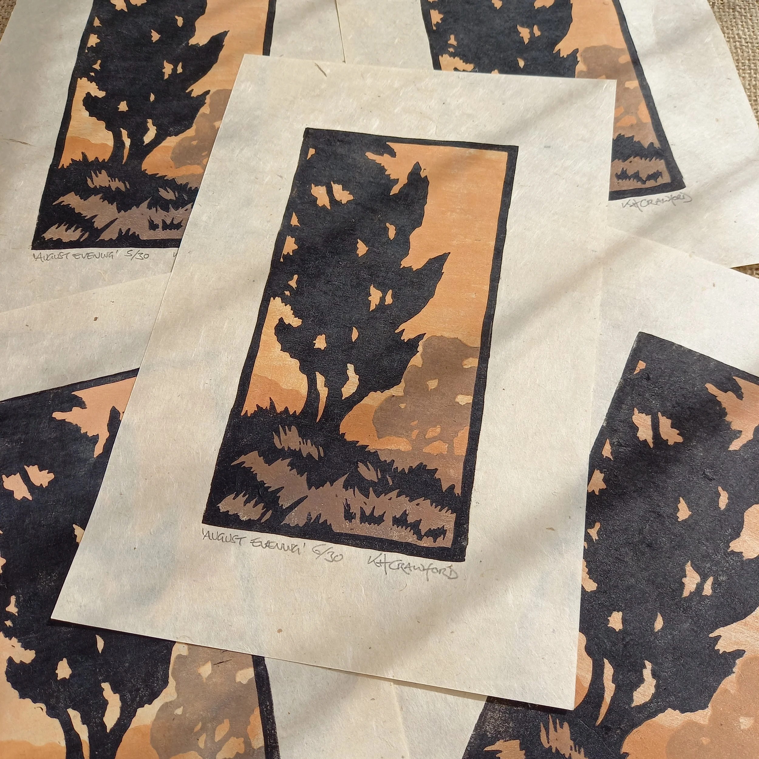
The Bunkoshi paper has a warm ecru colour to it and I can tear the edges nicely to replicate the natural deckled edges this paper has. I think the colour of the Bunkoshi sets off pure black ink well so I normally use this for plain black ink illustration prints unless I am after a sharper contrast in which case I will use white paper.

Plain black ink on ecru coloured paper
The contrast between the ink and paper is reduced and the warmth of the paper gives a vintage look to my illustration prints
The Washi paper is a little thinner but is a more durable whilst I am hand burnishing the prints so I tend to use this for prints that need three or more layers of ink. When I am using transparent layers of ink, the white paper provides a completely neutral ground that doesn’t affect the colours of the printed ink.

A multi layered print on white paper
I chose the smooth side of the white Washi paper for this more detailed print that uses transparent layers of ink
An alternative approach is to use the warmth of the Bunkoshi as a third colour within the print and when its ecru colour fits with my chosen palette, and will complement and intensify the transparent ink colours. I did this with my landscape lino print ‘Meadow Shade’, using the natural colour of this paper as a starting point for my colour choices.

‘Meadow Shade’
The muted colours of the ink layers are complemented by the natural colour of the paper
The Lokta paper is handmade in Nepal from the Lokta shrub so it is tree free! It has visible fibres in it so is more of a ‘rustic’ looking paper which I use for designs that this paper suits better, for instance woodland or bird prints. The Lokta is also the most absorbent of the three papers I use and takes colour I have brushed on to the lino blocks very well.
Lokta Paper
I chose the slightly textured surface of Lokta paper to fit with the subject of this print
Both the Bunkoshi and Washi papers are quite lightweight which is important because as I hand press my work, I need a thinner paper to allow me to print the images effectively. Both papers also have one very smooth side and a rougher side. I quite like the ‘noisy’ printed look I can achieve by using the rough side where the shapes of colour are broken up by tiny flecks of visible paper where the ink hasn’t taken. On more complex prints, I find the smoother side works better as I can be sure no detail is lost.

Both the Japanese papers I use have a smooth and rough side
Well, that’s a quick rundown of the papers I use in my printmaking, take a look at the papers I use for my other prints here. What do you think about these papers? If you are a printmaker or print collector, which printmaking papers do you like the best?
Feel free to let me know your thoughts in the comments!