

The Design of Art – Painting ‘Toll House’
I had some very kind comments about my observations on one of my ‘in progress’ social media posts the other day so in this post, I’ll share my thought process for a mini painting I completed in the autumn.
‘Toll House’ was a 5” x 5” mini painting inspired by the fantastic toll house building at the Weald and Downland Living Museum in Singleton, Sussex which I frequently visited when studying architecture in Portsmouth. For reference, I used one of the many photos I had taken of the historic buildings and splendid undulating countryside that the open air museum is nestled in.

The Beeding Toll House at the Weald and Downland Living Museum.
I often paint scenes with bright or colourful sunlight found at the beginning or end of the day. This reference photo was taken on an overcast day towards the end of October. The gently rusting leaves didn’t glow like they would on a bright sunlit day but instead had a more muted appearance which I thought harmonised well with the tiled roofs of the buildings in the scene. I decided to make this the focus of the painting. I had also decided that as the building was quite compact, and the most interesting trees were close by, I could crop the scene into a small square. If the building had been more horizontal, I think a landscape format board would have worked better.
I cropped the reference photo so the trees formed a central horizontal band and the house was low but off-centre, leaving little foreground as I wasn’t so interested in including a long lead-in to the scene.

I used a viewfinder to test a few cropping options before editing the photo.
With my reference photo cropped, I concluded the signpost, path and low wall in the foreground were far too much of a distraction and should be left out of the painting. As I wanted the house and context to remain recognisable, I felt the forms of these should be painted more faithfully. I did move the garden shed as it was too close to the edge of the composition and lead the eye out of the scene.
I prepared a five inch square panel with a warm red ground then once that was dry drew a grid in pencil which I then sealed using clear gesso.
I don’t usually start with an underpainting but I was keen to keep the values close so opted to use one which I would allow to partly show through in the final artwork and would form the shaded areas of the trees and house. The underpainting would establish the very darkest values in the artwork and all colour mixes painted on top or beside this would be lighter in value. This way there was no danger that I would paint shadows too dark and step outside of the narrow value range I wanted to maintain.
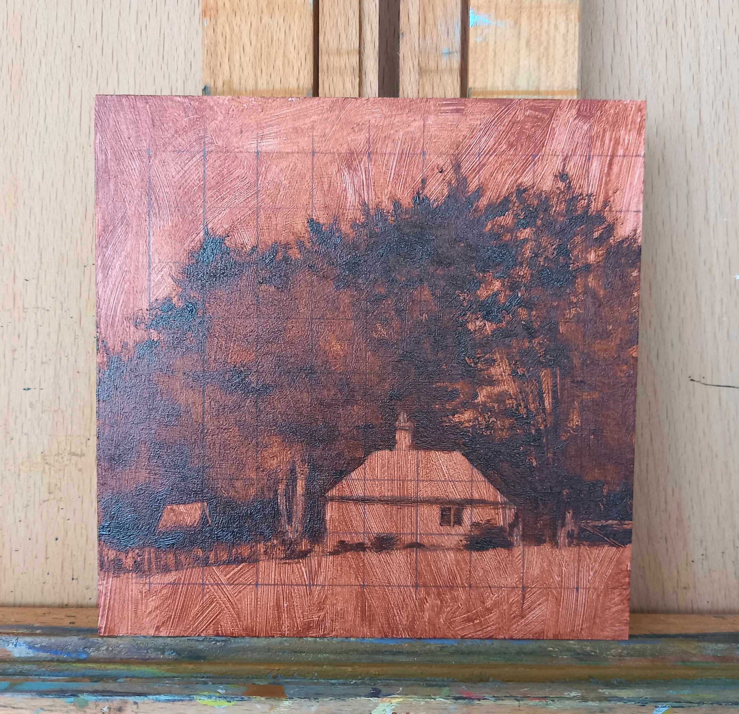
A grid helped me to accurately place the key features of the painting. I sealed the pencil lines before applying the oil paint.
With a mixture of thinned burnt sienna and ultramarine blue, I painted in the dark areas of the scene. Using the pencil grid, I could quickly and accurately sketch in the darkest key features of the building and the proportions of the trees onto my panel, referring to a matching grid overlaid on my cropped photo. There are many free phone apps available which will add a custom grid to your photo for this purpose. I used a paper towel to remove paint to help define the lighter areas of the tree to the left of the house. At this stage I could easily add or remove paint so I could experiment with refining the forms of the trees if I needed to. I also scratched out the gate and fencing.
I blocked in the lightest colours next to fix my value range. From this point, no colour mixtures would be lighter than the sky or darker then the underpainting. As the subtle colour harmonies of the photo had drawn me to the scene in the first place, bringing these into the finished painting was a priority. I wanted a close relationship between all the colours I placed on the board so mixing the exact colours as they appeared in the photo was less important. The colours I mixed for the sky and the grass in the foreground were much closer to the colours in the trees than they appeared in the reference photo.

With the darkest and lightest colours added, my value range was now set.
I deliberately left the foreground very plain so as not to distract from the focal points of the house and tree. I spent some time mixing and testing a green that was believable but also fitted alongside the other colours and I let some of the toned ground peek through the green paint to add some delicate interest. With simple calligraphic brushstrokes, I loosely described the gate.
Using a basic palette of ultramarine blue, cadmium yellow pale and burnt sienna with the occasional addition of alizarin crimson and cadmium orange, I dabbed in a patchwork of subdued earthy oranges, reds and greens for the trees. I refined the sky holes as they drew the eye a little too much for my liking. Once the main areas of paint were dry, I used a small brush to add some detail and additional colour to the building and suggested the fence. I had also scratched some horizontal lines into the building to imply weatherboarding.

The cropped reference photo alongside the finished painting.
As you will hopefully see from the side-by-side comparison of the reference photo and the final painting, I focused on one clear aspect of the original scene and worked to emphasise this in the finished artwork. I left out features which weren’t going to contribute to my vision for the painting, and I adjusted my paint mixes beyond the colours I saw in the reference photo to enhance the harmony within the finished artwork. I hope you like the painting, it didn’t stay in my shop for long!

The end result of many decisions!
Kester Hew Crawford is a landscape painter living in Norfolk, UK with a background in architectural design. You can find out more about his art tutoring and design coaching here.